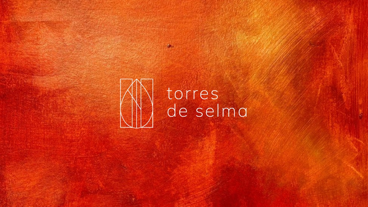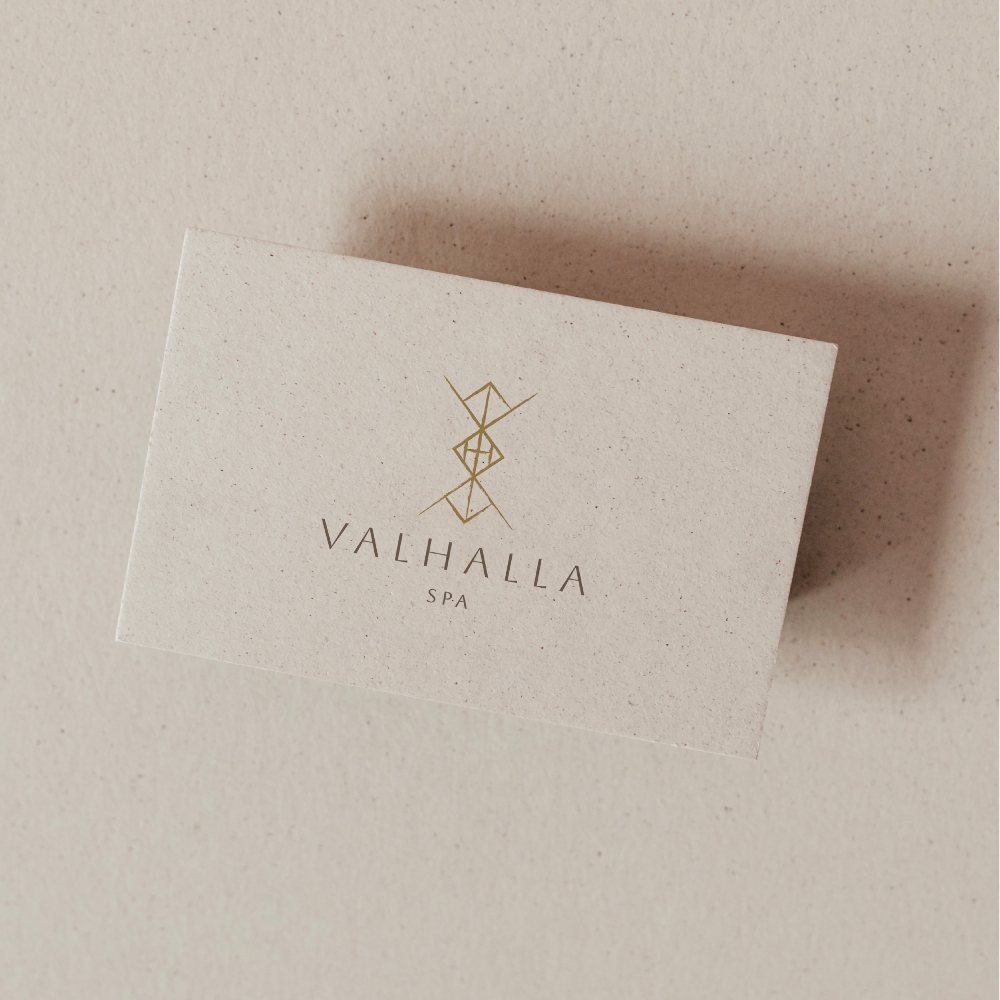
I grew up surrounded by Dutch design, which means clean grids, bold typography and a lot of white space. Then I moved to Barcelona, and my eye had to adjust. This city talks in color, texture and craft. Both places shaped how I design today and that mix is exactly what I offer to all of my projects.

Amsterdam: structure first
Dutch design has a reputation and it earns it. Think of the grid systems from the Bauhaus and Swiss design traditions that Dutch studios absorbed and made their own. Typography carries the message. Color stays disciplined. Negative space does real work instead of just filling gaps.
Clients from the Netherlands often want a brand that feels efficient. They value a logo that scales down to a favicon without losing meaning. They want guidelines that a whole team can follow without guessing. This is a strength. It keeps a brand consistent across every touchpoint, from an invoice to a billboard.
Barcelona: texture and warmth
Barcelona pulls from a completely different well: Gaudí’s organic curves with Catalan modernism. A street culture full of hand-painted signs, tile work and murals. Local studios lean into texture, illustration and warmer color palettes. Function still matters but feeling gets equal weight.
Working here changed how I think about branding. A logo does not only need to work on a business card. It needs to hold up on a hand-painted shopfront, a market stall or a tote bag someone actually wants to carry around the city.

Where the two meet
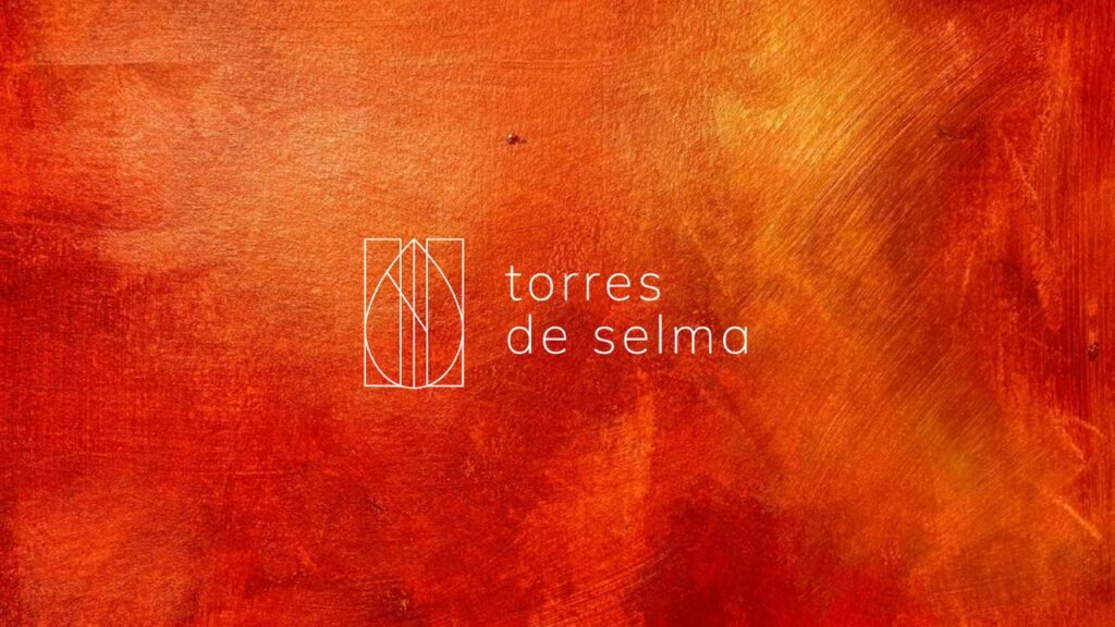
The most interesting brands I build sit between these two worlds. Dutch structure gives a brand its backbone: a system that stays consistent, scales cleanly and photographs well in every format. Barcelona gives it personality: warmth, texture, a human touch that keeps a brand from feeling like a template.
This is the exact space I work in. I’m a Dutch designer with a Barcelona studio. Clients get Northern European discipline combined with Mediterranean color and craft. It is not a compromise between two styles. It is a third option most local studios cannot offer, because most designers only know one side of it.
What this means for your brand
If your business operates internationally, or if you simply want a brand that feels considered rather than default, this blend matters. A rigid, purely grid-based identity can feel cold in markets that respond to warmth. A purely decorative identity can feel unstructured in markets that expect precision. The strongest brands borrow from both.
Curious what that could look like for your business? I offer a Branding Advice session where we map out exactly where your brand should sit on that spectrum, structure or warmth, and what a system tailored to your market would look like.